Add your promotional text...
Ecommerce
Redesign
📌Goal: Optimize user experience to boost conversion and reduce cart abandonment.
📌Achievements: Improved search, navigation, and interaction, increasing conversion by 20% and reducing abandonment by 15%.
📌Skills: UX Research, UX/UI Design, CRO, Interaction Design, Behavioral Analytics.
Context
Avanxa was looking to improve the shopping experience on its ecommerce site, as users were having difficulty finding products, navigating the site and interacting with key elements. This was negatively impacting conversions and brand perception.
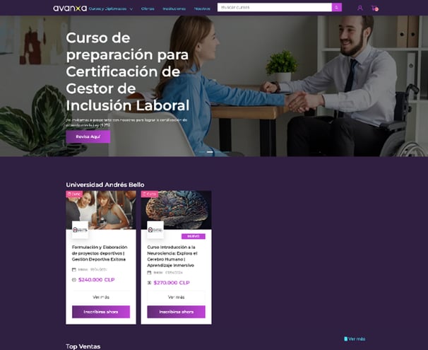
Original platform interface, prior to design iterations.
Problem
Inefficient search: Inaccurate results frustrated users.
Poor navigation: The structure made it difficult to find relevant content.
Confusing visual design: Lack of hierarchy and information overload.
Limited interaction: Filters and carousels did not work properly.
Outcome
Low conversion rate: Users abandoned the purchase process.
High bounce rate: They explored little content before leaving.
Loss of credibility: Outdated information affected trust.
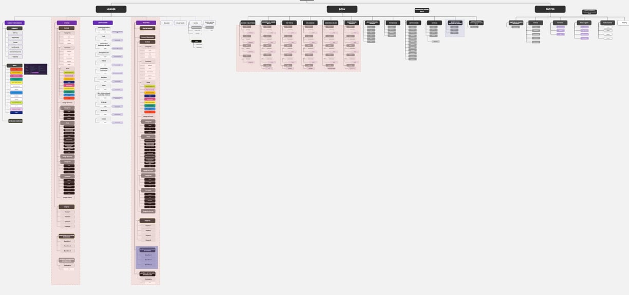

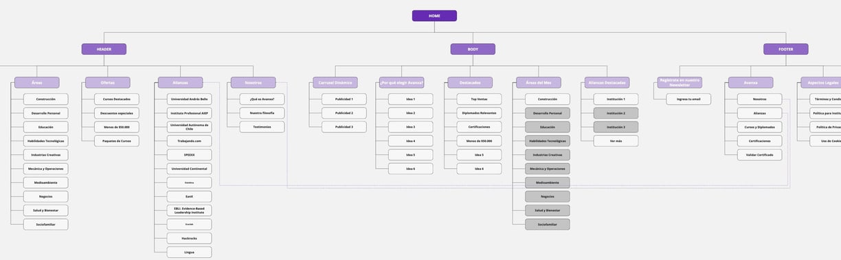
Original Information Architecture Assessment.
The information architecture had an irregular distribution, overloading the homepage and causing redundancies across different sections. This negatively impacted navigation experience and conversion rates.
UX Process
Research:
Heuristic audit and metrics analysis.
User interviews and surveys.
Social media analysis and reviews.
Definition:
Identification of critical navigation issues.
Creation of personas and empathy maps.
Validation:
Wireframes and prototypes iterated through user testing.
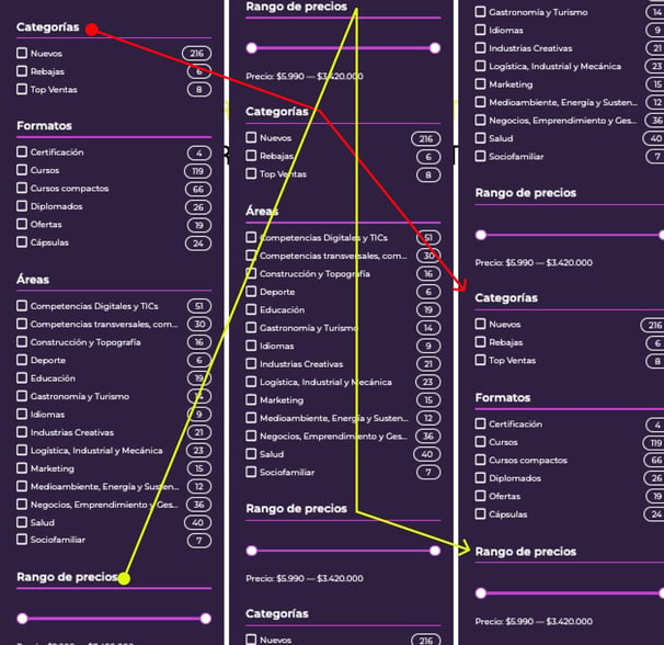
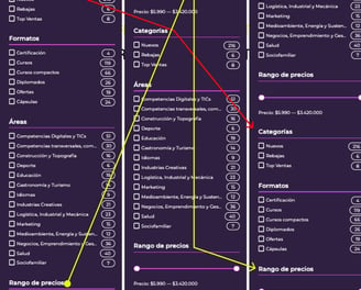
Audit: Filter Section Review
The platform analysis revealed unnecessary repetitions in key elements, such as filters, impacting usability and creating friction in navigation.
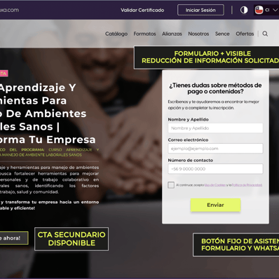
Implementation of Improvements
Actions taken to boost conversion.


Click on the images for a better view!
Solution
Optimized search with more precise filters.
Improved structure and visual hierarchy to guide users.
UI redesign with clearer and more concise content.
User testing to validate improvements.
Results
CONVERSIONRATE


+20%
-15%
CART ABANDONMENT
⭐ Better feedback and user experience
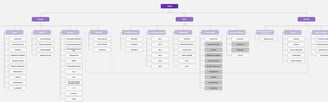
Reorganization of Information Architecture
The new architecture balances information distribution, removes redundancies, and enhances site exploration, optimizing conversion rates and reducing cart abandonment.
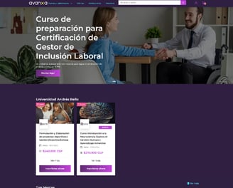
Before & After: Product Page View
The updated structure improves navigation, streamlines content, and enhances the user experience, leading to higher engagement and better conversion.